Get Started in Still Life Product Styling
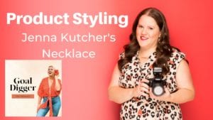
In this post, you can see me on set product styling Jenna Kutcher’s gold necklace where I discuss the basics of prop styling your photo. For our example, I am on a commercial product shoot styling a dainty gold necklace. Inside this post you will get:

- Onset best practices
- The methodology of a professional commercial prop stylist and photographer
On Set Best Practices
To keep your set running efficiently and smoothly, you want to minimize all the little variables and repetitive tasks that eat up a lot of your scheduled time. For example, instead of shooting your subject holding the camera manually, opt for a tripod instead. You choose your frame once, lock-off, and never have to adjust again for that angle.
Have two reflector cards, one white and one black to manipulate your light based on your needs for the photo. Since your camera is locked-off on the tripod, you are free to play with the cards off-frame for the best lighting results.
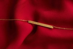
When shooting up close and personal, your camera will pick up all those tiny details even you may not notice. It will become obvious in the final photo whether that is a real gardenia or one made of fabric and plastic. The same is true for fruits and other organic items. When it comes to the props, always go for the real thing.
Methodology to Prop Styling
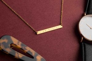
As you are framing your hero product, make sure she is the star of the show. What this means in photography terms is that there are some clear do’s and dont’s when you’re creating a lifestyle story for the product. For our purposes, we used the I Am Worthy Jenna Kutcher necklace. It is a minimal phrase piece in gold.
Your DO’s of product styling include: 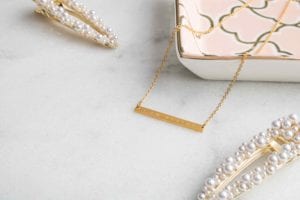
- Center the hero product in the frame
- Play up the details of the piece. Add accents that highlight and complement the product.
- Think about how the client will want to use the photo. Will they want to add text? Include shots with negative space for this reason.
- Think about what platforms the client will be using. Instagram Feeds require a square photo, while Facebook, billboards, or retail stretch graphics all have various dimensions.
Your DONT’s of product styling include:
- Pull focus from the hero piece. If you add an element with too much contrast or in a brighter color, it can split attention or create confusion.
- Forget to do as much as you can in the frame during the shoot. Clean up should be minimal in editing.
Mastering scale, color, composition, and achieving an artistic balance of elements is the recipe for a well-styled product photo. When you plan ahead to eliminate variables, you’ll have more opportunity and time to be creative and play with the styling in the photo, which always leads to the best-finished product for both you and your client.
Resources on offer
Grab my free step by step Client Onboarding Guide. 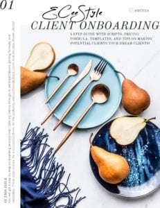
What you’ll find inside:
5 Step Guide with Scripts
Pricing Your Time Formula
Client-facing Email Templates
Photoshoot Planning Guide
Did you know I have a video training on this? Watch the whole YouTube video now HERE
While you are there remember to subscribe to my channel, like the video and leave a comment!
A new video drops every Tuesday.
comments +